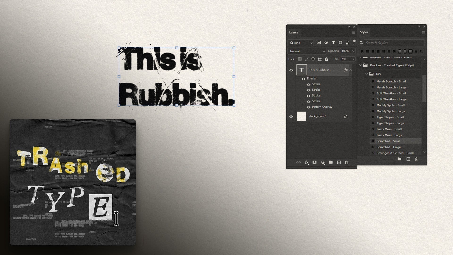
Transcript:
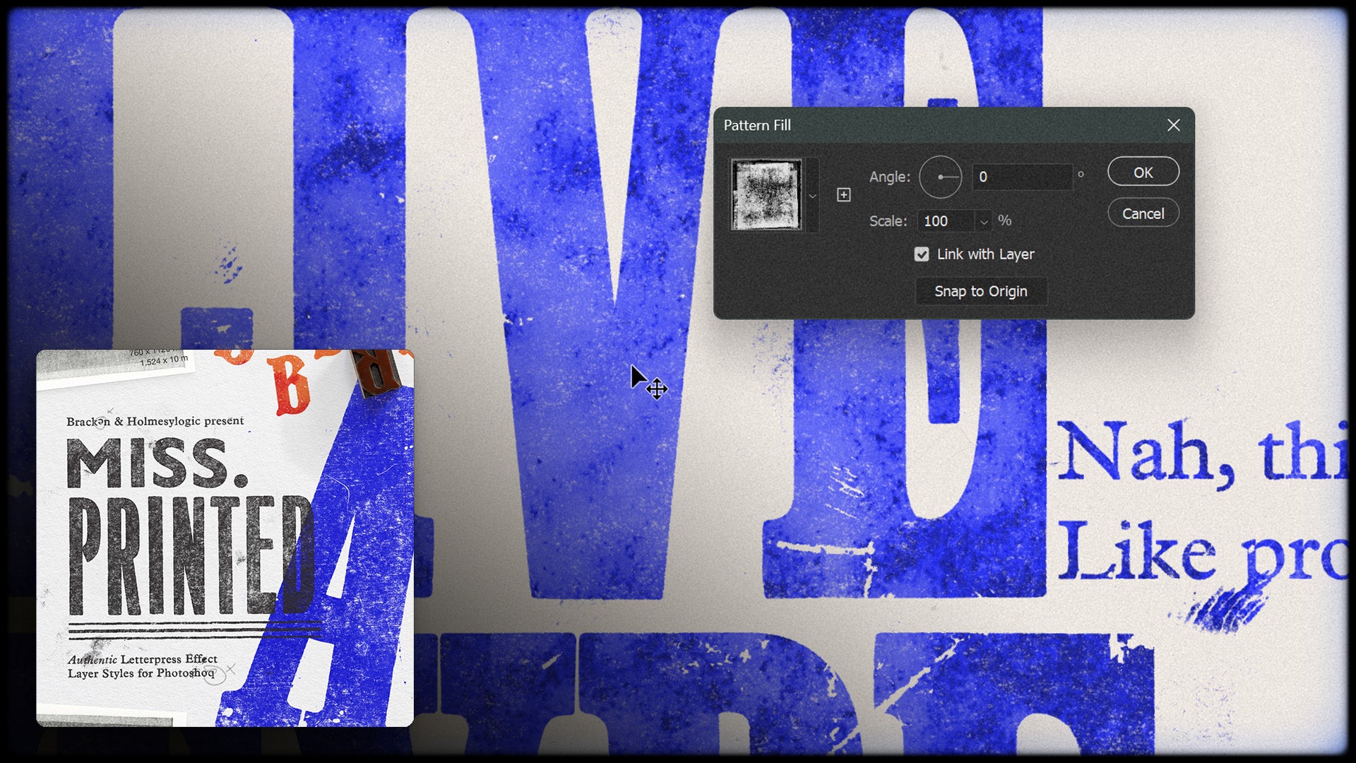
So included with these print effects and ink overlays are also some patterns and textures of printmakers' papers. And to apply one of these, I'm going to go to my adjustments layer, and go to pattern, and select one of these.
See the different looks. They're different kind of, when we hover over we'll see what type of paper it is, we've got a velvet paper, I believe a book paper, and satin, yeah.
So just select one of these, click okay. Now, quite often with paper textures, people put it at the bottom, and then change the blend if mode of the stuff above it.
I like to do it the reverse way, and I think it's more powerful. So, what I like to do is, pop, let's just rename this, paper texture.
I'd like to, get our paper texture, and duplicate it by hitting ctrl or command J. then, just so, we make sure that both move in the same place, I'm gonna select, shift, select both of them, and then right click, and select, link layers. That'll just mean that as we move one, both get affected. So, then what I like to do, If I just turn this top layer off, we'll select the bottom one, and set the blending mode to multiply.
Then I'll select the top one, just turn it back on. Keep it's blending mode on normal, but we can right click on it, go to blending options.
And then here, In the blend if, I'm going to take this slider, on the current layer, the dark slider, and slide this all the way to the right.
And you'll see, that it starts to reveal our artwork. But it's got a real crunchy, horrible result to it. So what we can do is hit alt or option, whilst clicking on one of the sides of this, and it'll just split it apart.
And I'm going to take the right hand one, this little bit, and take it all the way to the right.
And then we can take it's little mate over here, and just, move this around until we get a look that we like.
And if we think that's a bit too intense, we can always go up to the opacity, and sneak that down.
I like to go anywhere from 10% to 40%, depends on what kind of texture I'm looking for, but, somewhere around 30 is pretty cool, see we're getting a bit of that, texture coming through here. And again, we can always go, and change these.
Click OK. And there we have our, kind of highlights, effects and everything, and then this multiply, which is, adding a bit of a colour cast, and also the shadows.
And then, when I'm happy with it, I'm again, we can go in, go into these patterns, change the scale, you'll have to do this on both, so I'm just going to change this to 50, and double click on this one, and change that to 50 as well.
And let's say we're happy with that, I just select them, group them, call them paper textures, and lock them in place.
That means I can't access them. Accidentally click and drag the paper texture if I didn't want to. So that's a really fun way of applying a texture, highlights and lowlights, and it affects everything below it.
So anything we add in this layer stack below the paper textures is getting that lovely texture added to it.