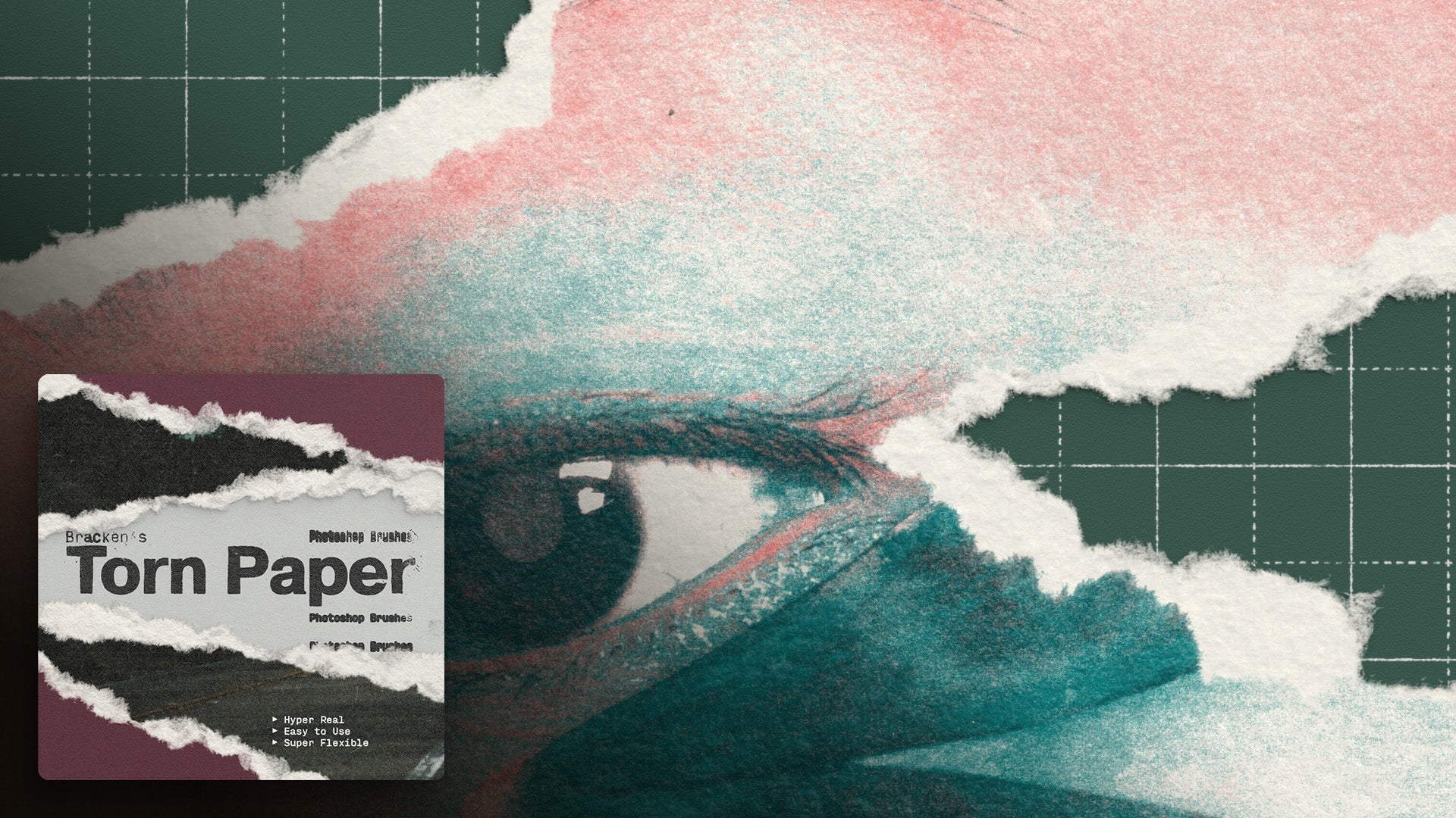
Using the 'Overlayers' textures.
Step 1: Identify Areas for Texture Application 0:00
-
Zoom in on your design to identify areas with varying textures and fidelity.
-
Look for clean areas and those with noise or texture.
Step 2: Add a Pattern Fill 0:34
-
Go to the pattern fill option in your design software.
-
Select a pattern that suits your design.
Step 3: Adjust Blending Modes 0:51
-
Select your layer with the pattern fill.
-
Experiment with different blending modes such as:
-
Overlay
-
Soft Light
-
Hard Light
-
-
Choose a mode based on the desired strength of the effect.
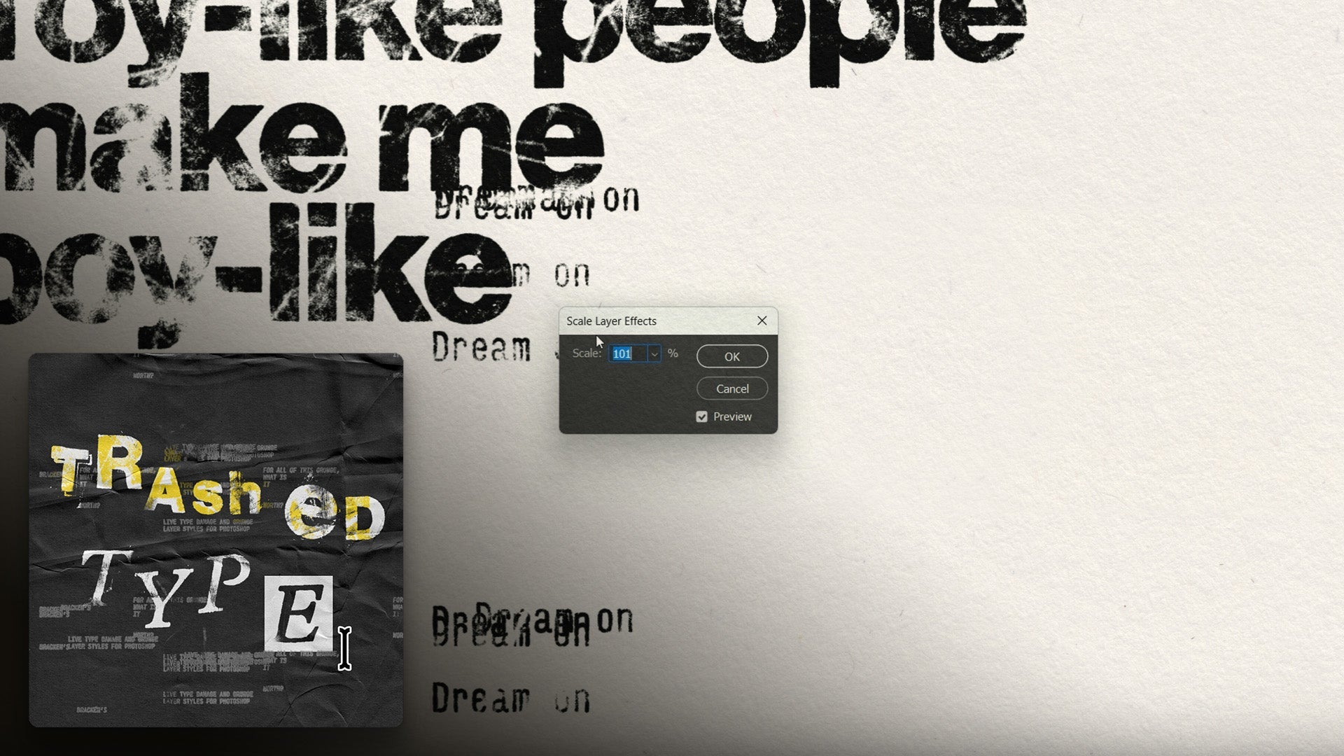
Step 4: Scale the Texture 1:23
-
If the texture appears too gritty, double-click on the layer.
-
Adjust the scale down to 50% or as needed.
Step 5: Modify Opacity 1:41
-
Change the fill or opacity of the layer to reduce the strength of the effect.
Step 6: Group Layers for Better Control 1:52
-
Select the layer and hit Control (or Command) + G to group it.
-
Name the group for easy identification.
Step 7: Add Adjustment Layers 2:10
-
Above the pattern fill in the group, add adjustment layers such as brightness and contrast.
Step 8: Fine-tune Contrast Settings 2:28
-
Adjust the contrast slider to change the strength of the texture effect.
-
Use the 'Use Legacy' option for more control if needed.
Step 9: Review and Finalize 3:11
-
Check the overall effect to ensure it adds a cohesive feel to the design.
-
Make any final adjustments to achieve the desired look.
Step 10: Experiment with Different Textures 3:38
-
Explore various textures and blending modes to find the best fit for your project.
Cautionary Notes
-
Be cautious with the strength of the texture; too much can make the design look cluttered.
-
Always keep a backup of your original design before applying heavy effects.
Top Tips
-
Use keyboard shortcuts for grouping and layer adjustments to speed up the process.
-
Save commonly used textures in a library for quick access in future projects.
Transcript
So here's a good example of where we can use the overlay textures to just add a little bit of visual glue to this piece.
If we zoom in all the way, we'll see that we've got some textured type, we've got an image, and the image itself has its own noise, and then we have this solid shape with zero noise.
So we've got some areas that are clean, some areas with different levels of fidelity and texture and adding one of these over layers will just melt it all together.
I'll show you how to do that. It can be as simple as just going to add a pattern fill. And just selecting one of these, and you'll see that they come through in their 50% grey with these highlights and shadows.
And we can just select our layer, go to our blending modes and just pick any one of these contrast blending modes, overlay, soft light, hard light, any of these little devils.
Some are stronger than others. Overlay and soft light are pretty soft. Hard light, vivid light, linear light, pretty strong. Pin light, a little bit weird.
Hard mix, very weird, but lovely. Let's start with hard light, because that does get some of the highlights and the shadows.
Now to me, this is a little bit too kind of gritty, and it almost looks a bit dirty. So what I'm going to do is I'm actually going to just double click on that and change the scale down to 50%.
That just makes it a little bit finer, and if you think this effect is too strong, you can just go in and change the opacity.
I'm changing the fill here, or I can change the opacity. Now, a nice way to get a little bit more control is I'm going to set this back to normal.
I'm going to hit control or command G to just pop it in a group. I'm just going to name this because otherwise I forget what things are.
So I've got this group selected now. Now I can select the whole group and pick hard light. Now this does the exact same thing, so it feels like an extra step that we didn't need to do.
But what we can do now is Above the pattern fill as long as it's still in the same group. We can add adjustment layers So what I like to do is go in and add brightness and contrast now I'm going As we change the contrast, we're basically changing the strength of it. 2:28 Going left is almost like reducing the opacity. But what we can do is we can go right and make it stronger.
Now if this contrast slider isn't giving you as much control as you want, you can click on use legacy. That'll just give you a little bit more bang for your buck.
So click on that. We can crank this all the way so it's almost completely unusable. Or we can sneak it down so it's super sore.
But we'll see, even if we just reduce it a little bit, it's just adding this uniform noise to everything. It's giving it this tactile feel, there's little print defects in there, so it's, It feels a little, it's more nuanced than just a digital noise, and it's just adding a lovely little bit of glue to all this. It's just melting it all together. It looks cohesive. It's really nice. And it's quite subtle, and ironically the compression on this video might not show it beautifully, but it's a really lovely effect that just adds that extra layer of, I would say, polish.
What's the opposite of polish? Grit. but it just lets everything melt together, really nice. And you go through these and you'll see that they have different kind of styles.
Some are a bit more papery, some look like camera noise, some are like splotchy ink. And misprints, this one's quite nice, it's got this kind of vertical column of misprint, uhm, and again, this is just one of the blending modes, this is hard light, you can go through, overlay, soft light, really lovely stuff, so yeah, have fun with them, pop them in groups, set them to different blending modes, play around with the settings, stack them, they're great fun.